

Celery: Sherwin-Williams' Color of the Year 2027
Sherwin-Williams has named Celery SW 6421, a soft, herbal green with subtle yellow undertones, its 2027 Color of the Year. Here is how the shade and its coordinating palette might work in a home.

Sherwin-Williams has chosen Celery SW 6421 as its 2027 Color of the Year. The company describes it as "an airy, herbal green that embodies fresh perspectives and elegance": a soft, muted green with subtle yellow undertones, sitting somewhere between a light pastel and a more grounded, herbal hue. It is presented under the theme "Refresh & Restore," with the tagline "Clarity and comfort unite."
What the color is like
Celery is not a deep, earthy green and not a crisp mint. The brand frames it as a calm, livable shade meant for spaces that are lived in, and its design-professional pages list visual references such as striated green stone, shimmering water and early morning light filtering through leaves. The yellow undertone is what keeps it warm rather than cool, which matters when a room faces north or is lit mostly by lamps in the evening.
Sherwin-Williams lists it in Matte, Eg-Shel, Satin and Semi-Gloss finishes, and Celery is also part of the company's Colormix Trend Forecast 2027, called Rewild.
The coordinating palette
Alongside the color, Sherwin-Williams has published a set of coordinating hues it calls Curated Harmony, grouped on its design pages as follows:
- Light backdrops: White Flour SW 7102 and Cocoon SW 6173
- Warm neutrals: Woven Wicker SW 9104, Plum Brown SW 6272 and Artichoke SW 6179
- Accents: Kirsch Red SW 6313, Potentially Purple SW 6821, Cosmos SW 6528 and Georgian Bay SW 6509
- Stain: Minwax Pickled Oak MW 260
The accents are the surprising part. A cherry red and a soft purple beside a pale green read almost like a garden border, and they give the palette more personality than a simple green-and-cream scheme.
How a designer might use it
Sherwin-Williams suggests Celery for a long list of rooms, from walls in bedrooms and bathrooms to kitchen cabinets, dining rooms and sunrooms.
- Kitchen cabinetry. A soft green on lower cabinets, with White Flour on the walls and a pale oak tone like Pickled Oak on open shelving, keeps a kitchen light while giving it some warmth. Unlacquered brass or aged bronze hardware tends to sit well against yellow-leaning greens.
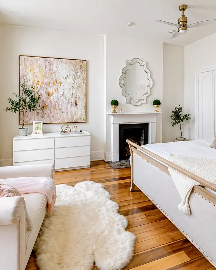
- A primary bedroom. Celery on the walls in a matte finish, with Cocoon or White Flour on the trim and ceiling, creates a restful envelope. Linen bedding, a cane or rush headboard and a touch of Plum Brown in a throw or lampshade would ground it.
- A powder room or bath. In a small room the color can be used everywhere, walls and trim alike, in a satin or semi-gloss for easier cleaning. A floral or stripe wallcovering with a hint of Kirsch Red would echo the accent colors.
As with any light, warm green, sample it in the room itself and look at it in morning and evening light before committing: the yellow undertone can read stronger under warm bulbs.
What it means for a home in Lexington
Central Kentucky's older homes, with their deep window casings, painted millwork and views onto gardens and pasture, suit greens that feel drawn from the landscape. Celery offers a gentler option than the darker olives and forest greens of recent years: one that can brighten a north-facing room, freshen a dated kitchen without a full renovation, or quietly connect an interior to the trees outside. If you are weighing a new color for a room in your own home, we would be glad to hear from you: get in touch.


